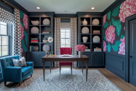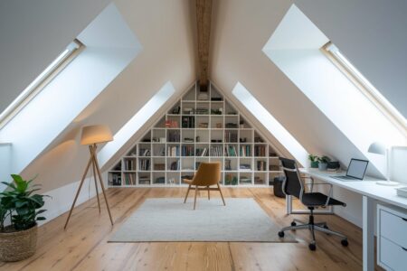
Pastel home office ideas are having a well-deserved moment. More people are working from home than ever before, and the days of plain white walls and uninspired furniture are officially over. Soft blush pinks, powdery blues, gentle lavenders, and minty greens are showing up in beautifully styled home offices across the globe. These muted, delicate shades do something practical: they calm the mind. And a calm mind works better.
Pastels are also endlessly versatile. They can anchor a minimalist aesthetic or layer beautifully into a more maximalist, eclectic space. Whether you have a dedicated room or a small corner carved out of a living area, there is a pastel palette that will make it feel intentional and polished.
Ready to give your home office a refresh? Here are pastel home office ideas to spark your creativity.
- 01 of 9
Soft Blush Pink Walls
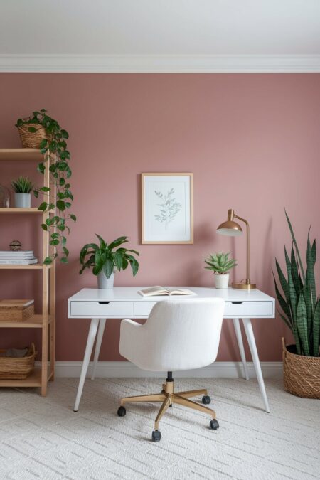
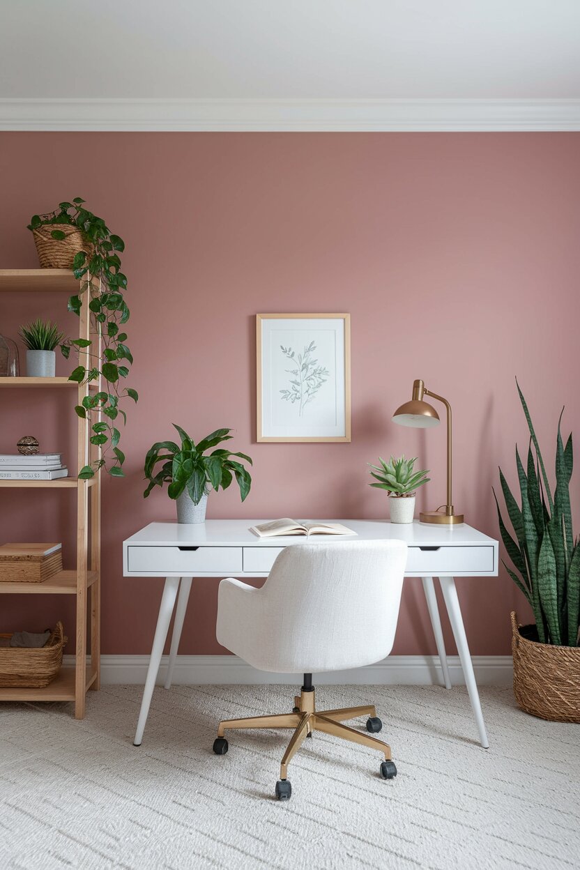
Pink has a complicated history in interior design. For a long time, it was written off as too feminine or too playful for a serious workspace. That thinking is outdated. A muted, dusty blush pink on the walls of a home office creates a warm, inviting atmosphere without feeling distracting. It is grounding in a way that brighter shades simply are not.
Pair blush pink walls with white furniture and natural wood accents to keep the space feeling fresh and modern. A white linen desk chair, a simple wooden bookshelf, and a few gold or brass hardware details will tie everything together beautifully. Avoid going too warm with your wood tones. Light-stained oak or birch reads especially well against blush.
Add a few greenery touches, like a trailing pothos or a fiddle-leaf fig. Plants next to soft pink walls look effortlessly chic. They also improve air quality, which is a bonus in any work environment.
RELATED: 11 Pink Home Office Ideas Designed to Fuel Your Daily Creative Hustle
- 02 of 9
Powder Blue Desk Setup

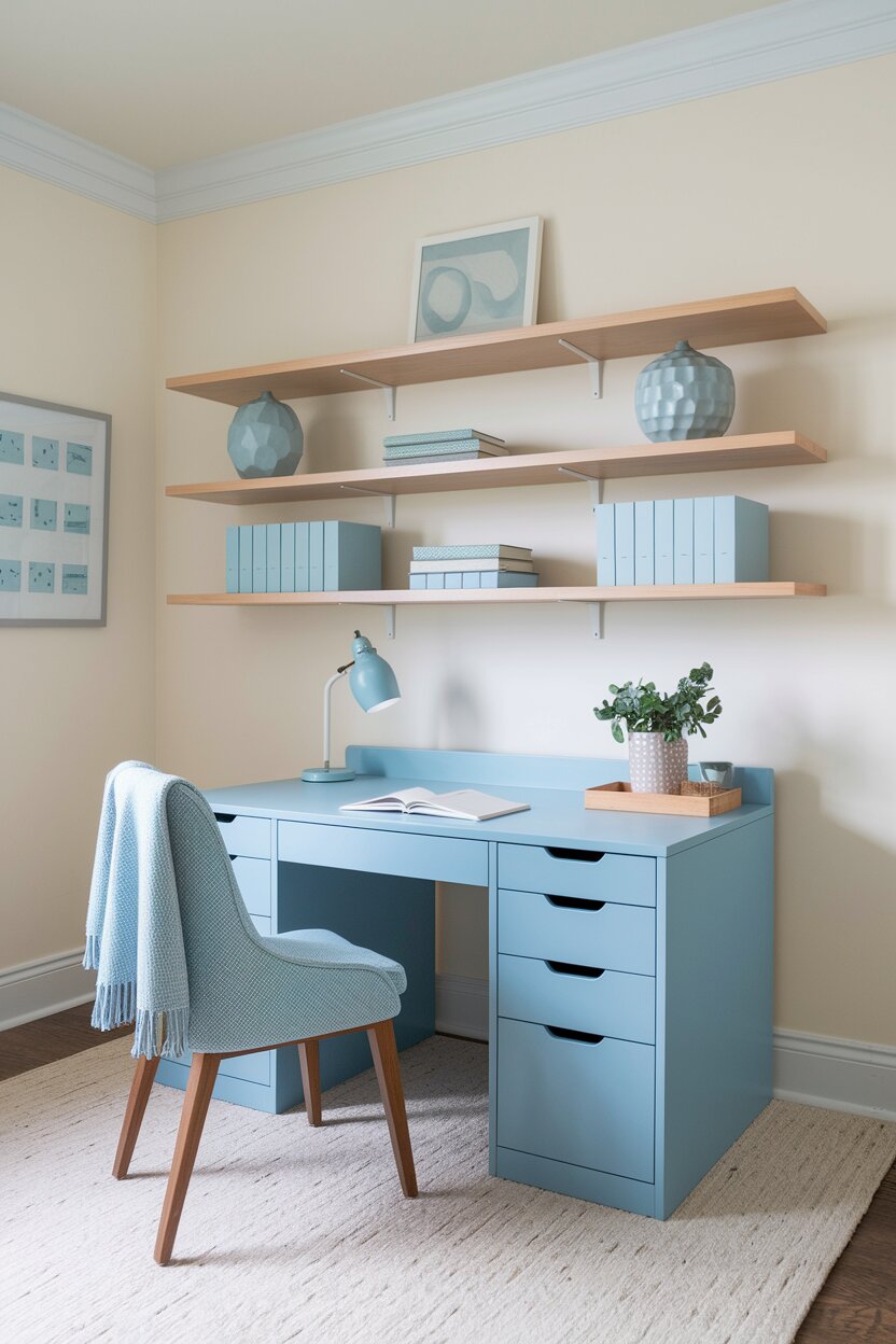
Blue has long been associated with focus and productivity. There is actual research behind this. The color blue is known to promote a sense of calm while keeping the mind alert. A powder blue desk or desk chair brings all those benefits into your home office without overwhelming the space.
You do not have to commit to painting the whole room. A single powder blue desk can anchor the entire workspace. Surround it with neutral tones: off-white walls, a cream-colored rug, and simple white or natural wood shelving. The desk becomes the focal point. Everything else plays a supporting role.
For a more pulled-together look, pick up a few small accessories in the same pastel blue family. A ceramic pen holder, a pale blue desk lamp, or a matching file tray can unify the space without making it feel too matchy-matchy.
- 03 of 9
Lavender Accent Wall
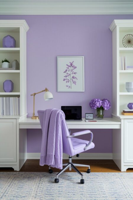
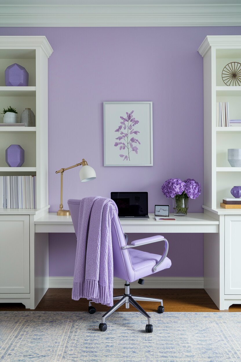
Not everyone wants to commit to painting four walls. An accent wall is a clever compromise. It introduces color and personality into a space without requiring a full repaint. Behind your desk is the most strategic place for an accent wall in a home office. It frames you beautifully on video calls and gives you something inspiring to look at while you think.
Lavender is a particularly thoughtful choice for an accent wall. It sits in a unique space between cool and warm, which means it pairs well with a wide range of colors. It looks stunning next to gray, white, natural wood, and even deep charcoal. Lavender also photographs beautifully, which matters if you spend a lot of time on camera.
To enhance the effect, lean into the purple family with your accessories. Amethyst bookends, a lilac throw draped over your chair, or a violet-tinged abstract print on the wall can make the lavender accent feel intentional and curated.
- 04 of 9
Mint Green and Natural Wood
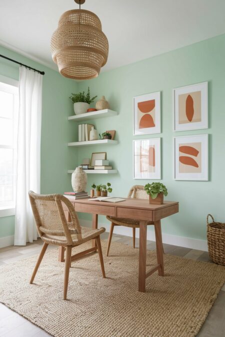
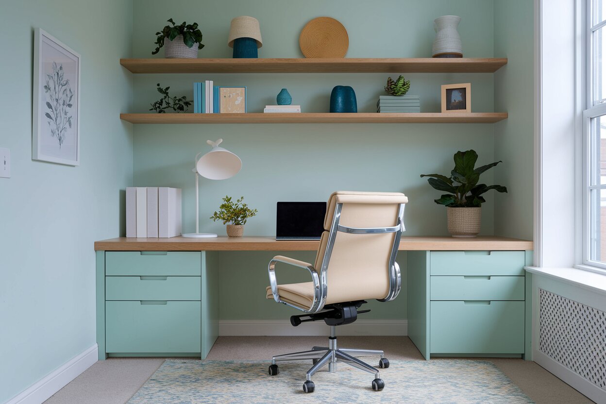
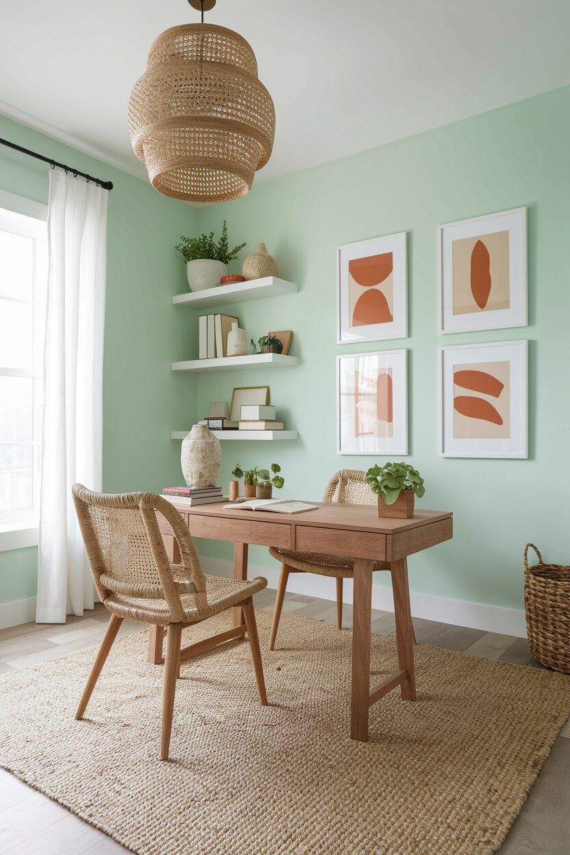
Mint green is energizing without being loud. It has just enough brightness to liven up a space and just enough neutrality to stay easy on the eyes over a long workday. It is one of the most underused pastel home office colors, which means it will look fresh and unexpected in a way that more popular shades cannot always guarantee.
Pairing mint green with natural wood is a match made in design heaven. The organic warmth of wood balances the cool crispness of mint. Use a walnut or medium oak desk as the centerpiece. Add woven textures through a jute rug or rattan organizers. These natural materials keep the space from feeling too clinical.
Layer in white accents to brighten the room further. White curtains, white wall shelves, and white-framed prints create contrast that keeps the mint from feeling flat. A few terracotta or burnt orange accessories can add warmth and prevent the space from leaning too cool.
Check other colors that go with mint green to easily customize your workspace. For instance, soft blush pink creates a chic, retro-modern look, while navy blue offers a sophisticated and grounding contrast. If you prefer a sleek, contemporary vibe, charcoal gray paired with gold metallic accents will instantly elevate the design.
- 05 of 9
Pastel Yellow for a Bright, Cheerful Corner
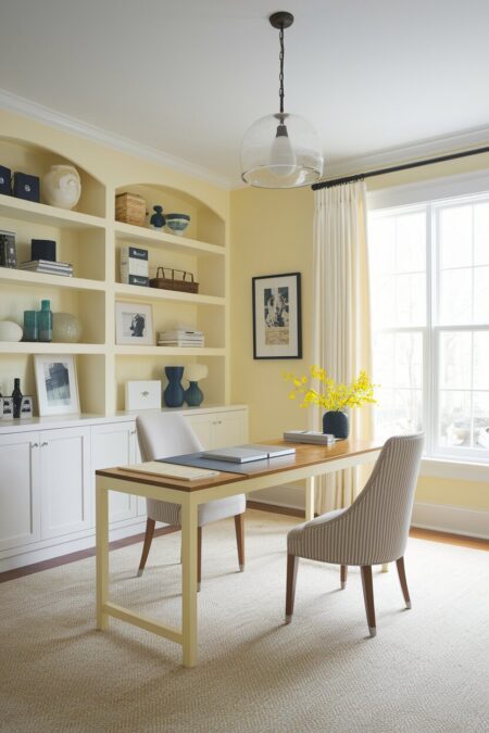
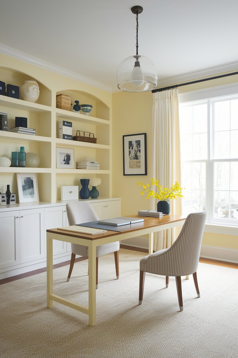
Yellow is the color of optimism. At full saturation, it can feel overwhelming in a small space. But pastel yellow? It is a completely different story. A soft buttercream or pale lemon yellow makes a home office feel sunny and uplifting, even on gray mornings when motivation is hard to find.
This pastel works especially well in north-facing rooms that do not get a lot of natural sunlight. It mimics warmth. It tricks the eye into feeling like the light is brighter than it actually is. If your home office tends to feel a little dark or cold, a soft yellow on the walls can make a significant difference.
Keep the rest of the room light and airy. White trim, cream-colored furniture, and simple, uncluttered shelving will let the yellow breathe. Introduce a few navy or teal accessories for contrast. Those cool tones will make the yellow pop without competing with it.
- 06 of 9
Mixed Pastel Color Palette
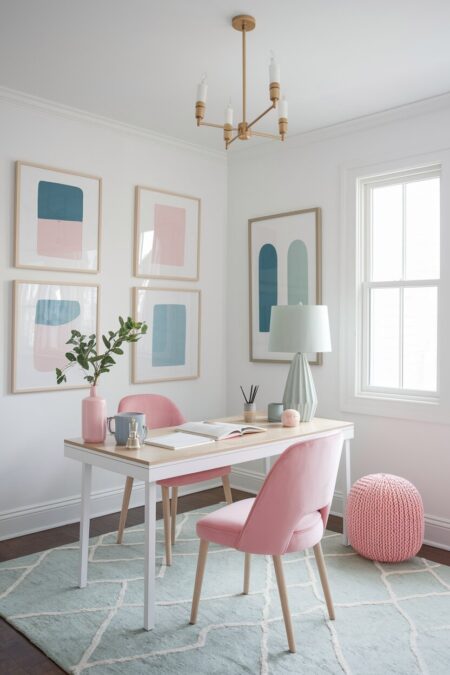
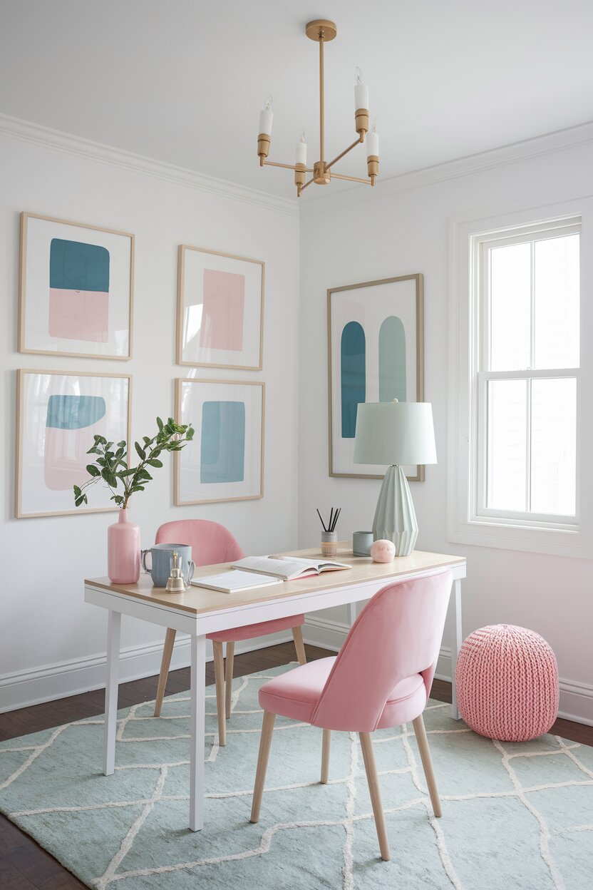
Who says you have to pick just one? Mixing pastels is one of the most joyful ways to design a home office. The key is balance. When you combine multiple soft shades, you need to keep the saturation level consistent across all of them. Pair blush pink with baby blue and pale sage. All three share the same low-saturation quality, which is what makes them harmonize rather than clash.
Use a neutral base to anchor the mix. White walls are the most forgiving backdrop for a multi-pastel space. They let each color shine without creating visual noise. Bring in your chosen pastels through furniture, soft furnishings, and accessories. A pink chair, blue desk accessories, and a sage green lamp shade can create a cohesive, playful look.
Limit yourself to three or four pastel shades maximum. More than that starts to feel chaotic rather than curated. Think of it as building a capsule wardrobe for your workspace: everything works together, and nothing feels out of place.
- 07 of 9
Pastel Home Office with Maximalist Touches
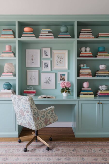
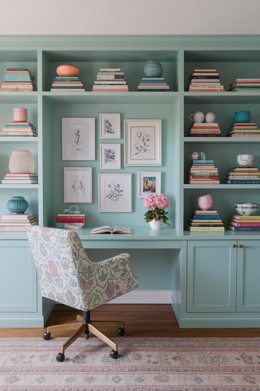
Pastels are often associated with minimalism. Clean lines, sparse surfaces, and an overall sense of calm. But pastel shades work just as beautifully in a more layered, maximalist space. The softness of the colors actually prevents the room from feeling visually overwhelming, even when there is a lot going on.
In a maximalist pastel office, layering is everything. Stack books with coordinating spines on open shelves. Hang a gallery wall of prints, illustrations, and personal photographs in mismatched frames. Layer rugs in complementary pastels over a hardwood floor. Introduce patterned textiles through a printed desk chair or an embroidered cushion.
The trick is to let the pastel palette unify everything. When every element, even the most eccentric one, shares the same soft color story, the room feels deliberately designed rather than accidentally cluttered.
- 08 of 9
Pastel Peach Office with Warm Metallic Accents
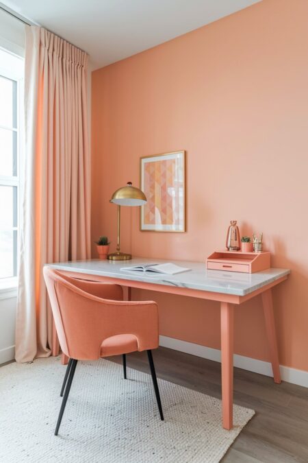
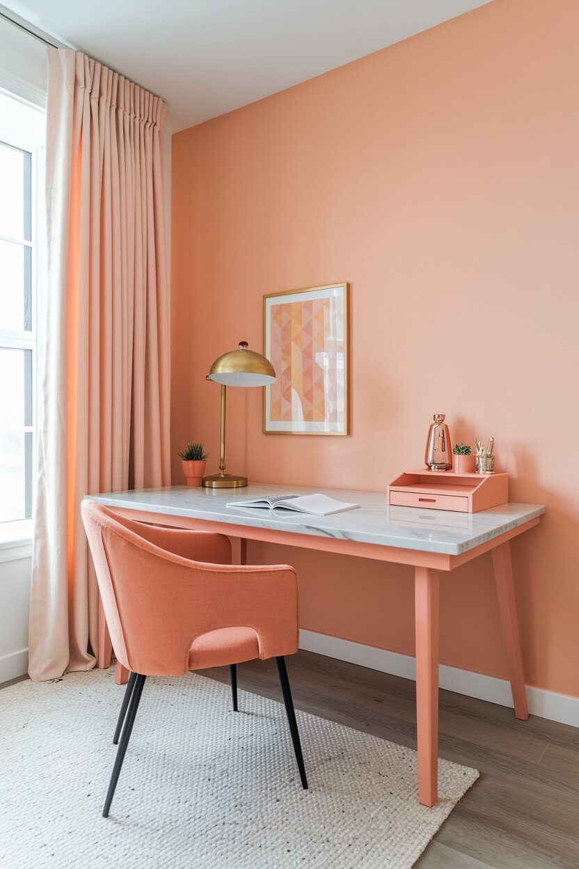
Peach is one of the most underappreciated pastel shades in home design. It is warmer than pink and more interesting than beige. In a home office, it creates a sense of warmth and welcome that is genuinely hard to achieve with cooler tones. It feels energizing and sophisticated at the same time.
Warm metallics are the natural partner for pastel peach. Gold, brass, and rose gold all look exceptional against a soft peach backdrop. A brass desk lamp, gold cabinet handles, or rose gold desktop accessories will add a touch of luxury without overwhelming the subtlety of the pastel.
Marble is another material that pairs beautifully with peach. A marble desk surface or a small marble tray for your stationery adds texture and visual interest. Stick with warm-toned marble, such as shades with gold or peach veining, to keep the palette cohesive and intentional.
- 9 of 9
Monochromatic Pastel Office in Lilac
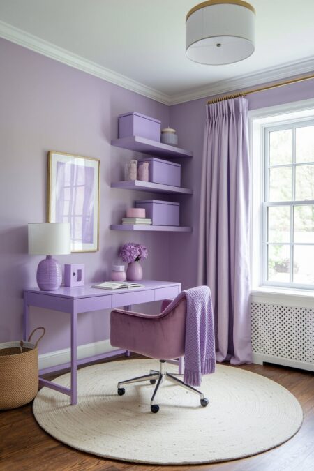
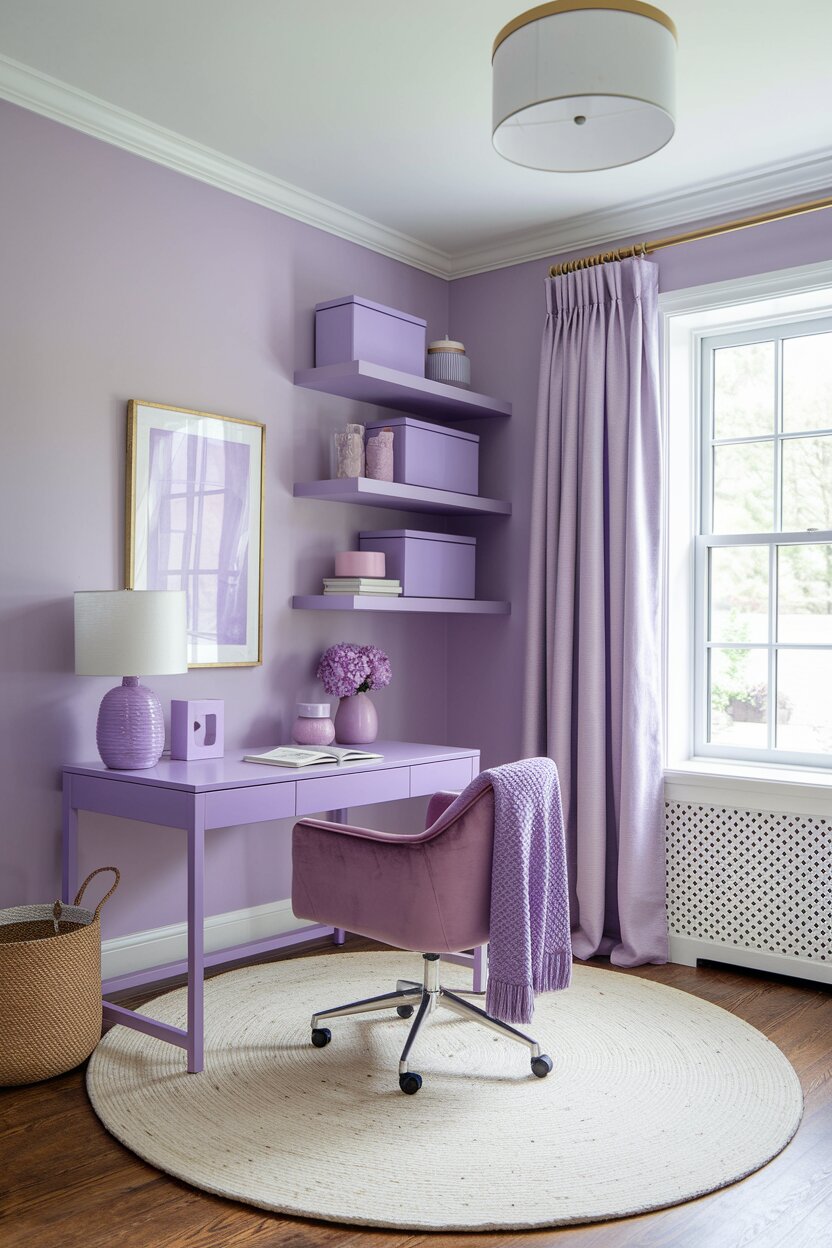
A monochromatic room done well is one of the most striking design choices you can make. It takes confidence. But when you commit to a single hue and explore its full range of shades, textures, and finishes, the result is undeniably beautiful. Lilac is a perfect pastel for this approach.
Start with a mid-tone lilac on the walls. Move deeper with a plum-toned velvet chair and lighter with pale lavender curtains. Bring in lilac-tinted storage boxes, a soft violet desk mat, and a light purple throw blanket over the back of your chair. The variation between the shades is what gives the room depth and dimension.
White trim and a white ceiling are essential in a monochromatic lilac space. Without those contrast points, the room can start to feel like it is closing in. The white provides visual breathing room and keeps everything feeling fresh rather than heavy.
Natural textures are your best friend in any monochromatic space. A linen lampshade, a woven basket, or a rough ceramic vase will break up the color without breaking the palette.
How to Choose the Right Pastel for Your Home Office
Before you commit to any pastel home office idea, think about how you actually use your space. Do you need deep focus and concentration? Blues and lavenders tend to promote that. Do you want to feel energized and motivated? Yellows and peaches are worth considering. Are you looking for creativity and inspiration? Pink and mint often get that job done.
Lighting matters more than most people realize. A pastel that looks perfect on a paint chip can shift significantly once it is on the wall and exposed to your room’s specific light. Always test your chosen shade in your actual space before committing. Pick up a few sample pots and paint large swatches. Live with them for a day or two.
Also consider the undertones in your pastel. Most soft shades carry hidden undertones that only become obvious against certain backgrounds. Blush pink can lean salmon. Powder blue can read almost gray. Lavender can drift toward pink or blue depending on the light. Understanding the undertones in your chosen shade will help you select complementary furniture and accessories with much more confidence.
The good news is that pastels are forgiving. They are soft by nature. Even if you make a choice that is not quite perfect, the gentle quality of the color will make it far less jarring than a more saturated shade would be. Your pastel home office is going to look beautiful. The only question is which shade to start with.