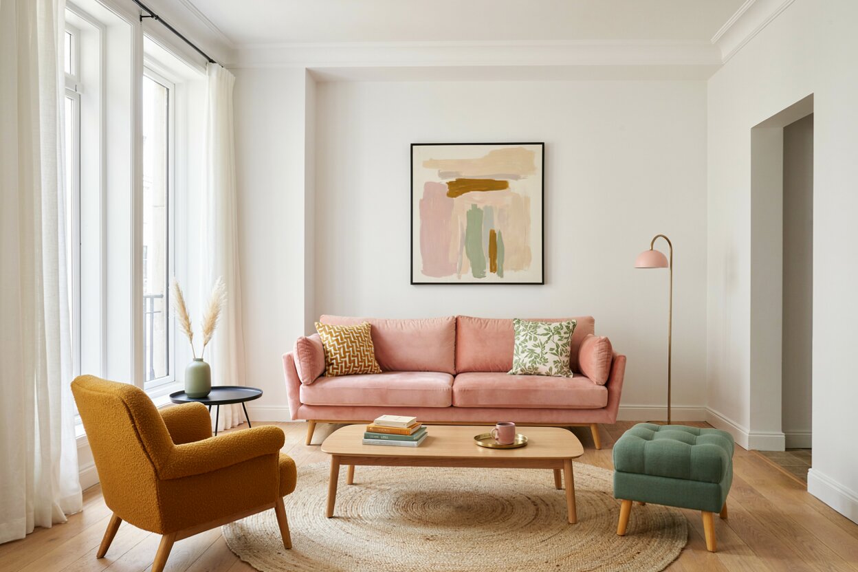
Say the word “pink” and many people picture a nursery or a candy shop. That’s a shame. It’s one of the most flexible colors you can bring into a home. Shades of pink run from a barely-there blush to a juicy, saturated magenta. Each one changes personality depending on the color that pairs with it.
Add charcoal, and pink turns polished. Add mustard, and it turns playful. The right color combination can make one room feel calm, bold, or downright glamorous.
Below are colors that go with pink, along with easy ways to use each combo in bedrooms, kitchens, living rooms, and beyond. Pick a favorite color pairing. Then brush a test patch on the wall and live with it for a day or two before you commit.
- 01 of 13
Pink + Green
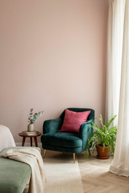
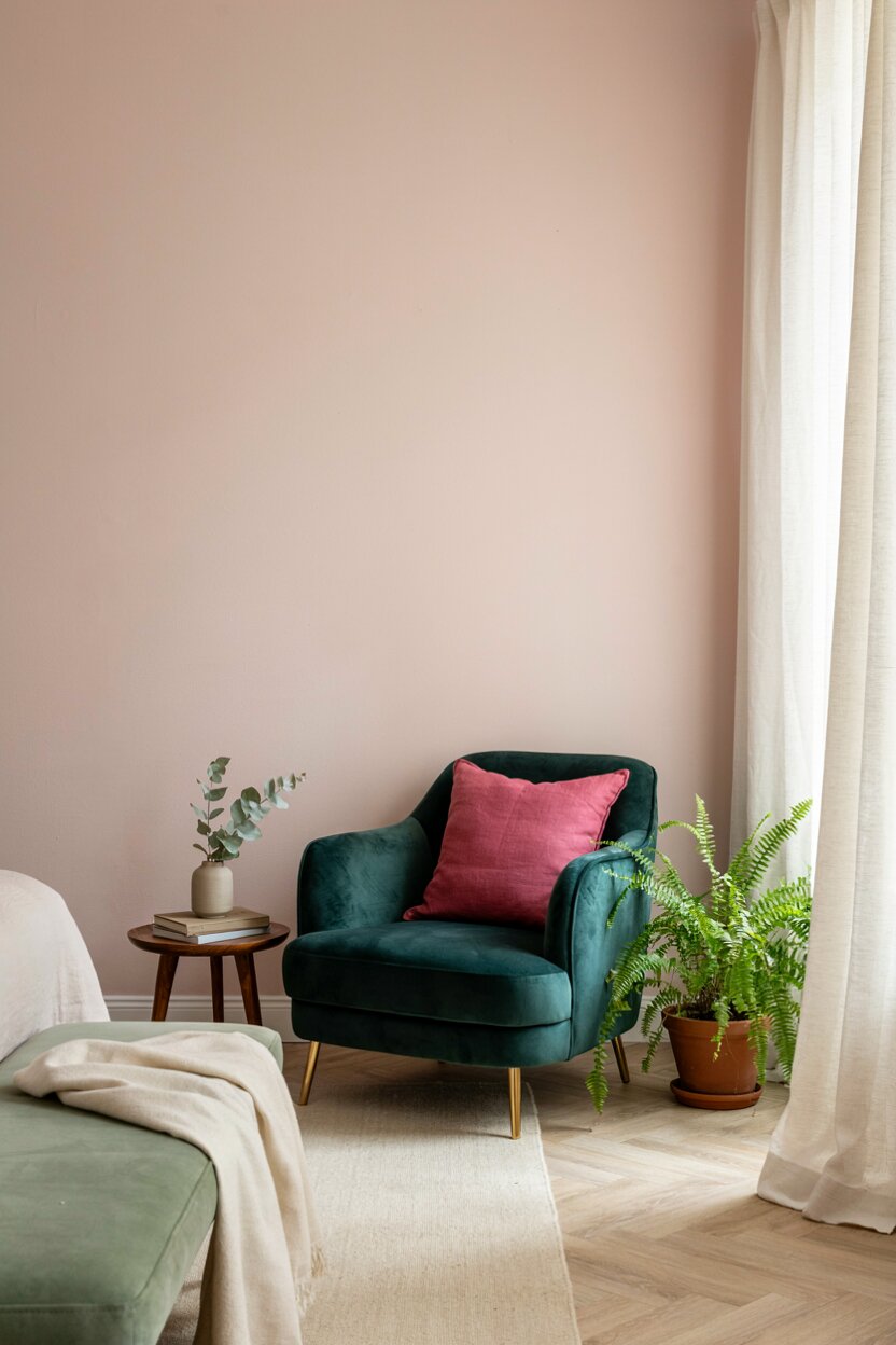
Nature already did the hard work here. Rose petals and leaves share this exact color combination, so it feels natural indoors. Sage green with dusty rose makes a calm duo for bedrooms and home offices. Want more drama? Set a deep emerald velvet chair beside a fuchsia pillow. Plants help too. A leafy fern in a blush-colored room adds green without a single drop of paint.
- 02 of 13
Pink + Gray
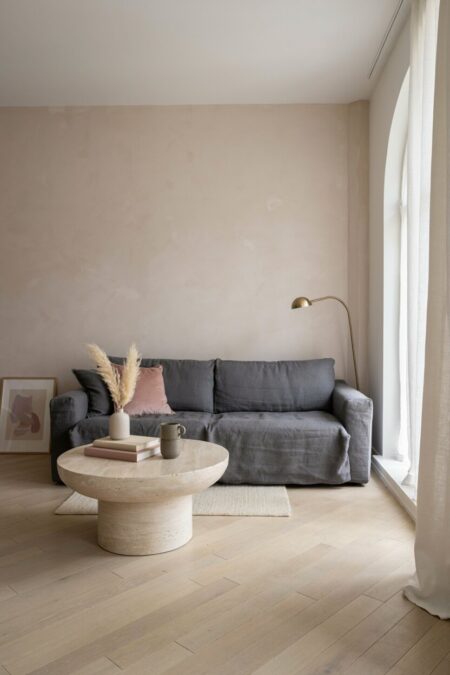
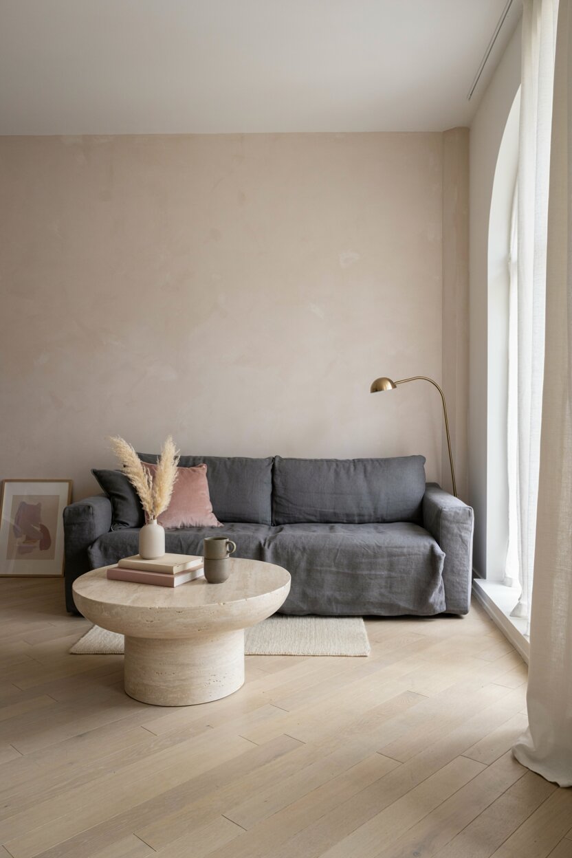
Gray is a color that pairs with pink almost effortlessly. It cools down the sweetness and adds a grown-up edge. Picture pale blush walls behind a slate sofa. Or a charcoal accent wall framing a soft pink headboard. Mind the undertones, though. A warm greige flatters peachy pinks, while a blue-leaning gray suits cooler, rosier ones. This combo reads modern and quiet, and it won’t feel dated in a few years.
- 03 of 13
Pink + White
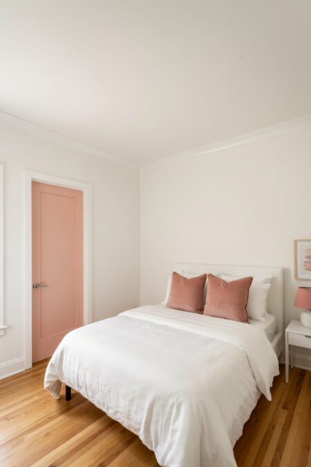
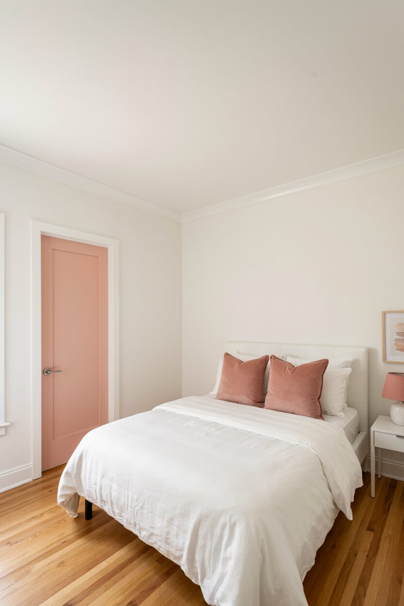
Crisp. Clean. Easy. White gives shades of pink room to breathe. Use it on trim, ceilings, and larger furniture, then let the blush appear in pillows, art, or one painted door. In a small room, this color pairing bounces light around and makes the space feel bigger. Choose a warm white if your pink leans peach. Pick a cooler white when the pink has a hint of blue.
- 04 of 13
Pink + Navy Blue
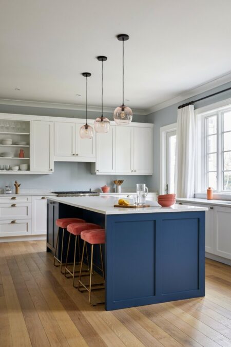
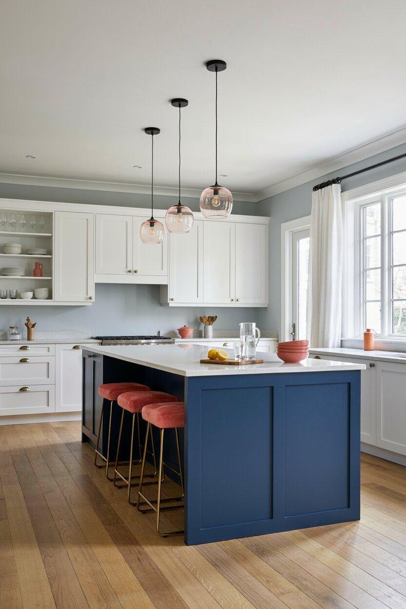
These two differ in mood but get along beautifully. Navy anchors pink so it never feels too sweet. Try a navy kitchen island beneath blush-toned pendant lights. Or hang navy drapes in a rosy living room. Add a little white and the look turns fresh and nautical. Coral pink works well here. So does bubblegum, if you want something more playful.
- 05 of 13
Pink + Gold
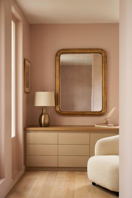
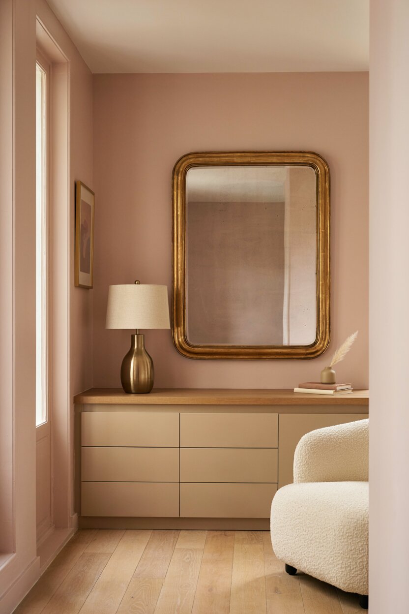
Glamorous, but not loud. Gold warms up pink and gives it a luxe finish. Keep the metal to small touches. A brass lamp, a gilded mirror, or a set of cabinet pulls will do the job. Blush walls with a gold-framed print feel soft and elegant at the same time. Brushed finishes look more relaxed than shiny ones, so lean that way for a laid-back mood.
- 06 of 13
Pink + Black
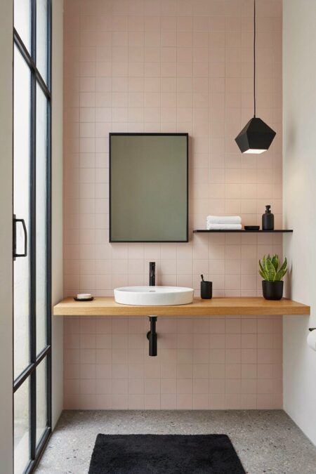
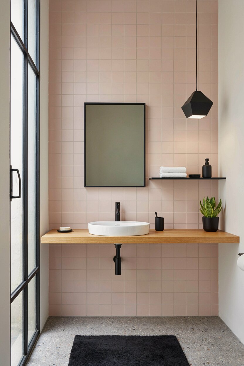
Sweet meets sharp. Black gives pink a graphic punch that feels fresh and modern. It’s a great combo in bathrooms, where black fixtures stand out against pale pink tile. It also suits dining rooms with black chairs around a light table. Watch the balance, though. Too much black swallows a room. Let pink lead, and use black as an outline in window frames, shelves, and lighting.
- 07 of 13
Pink + Yellow
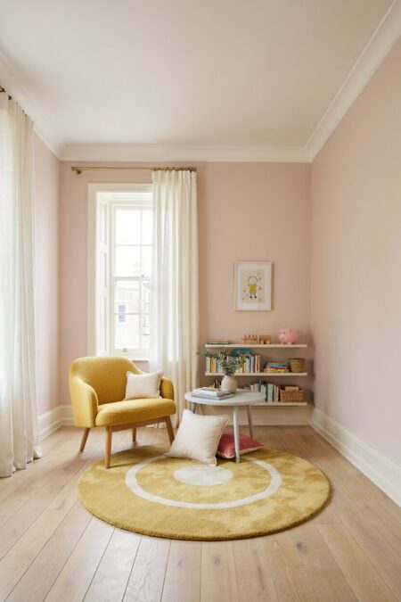
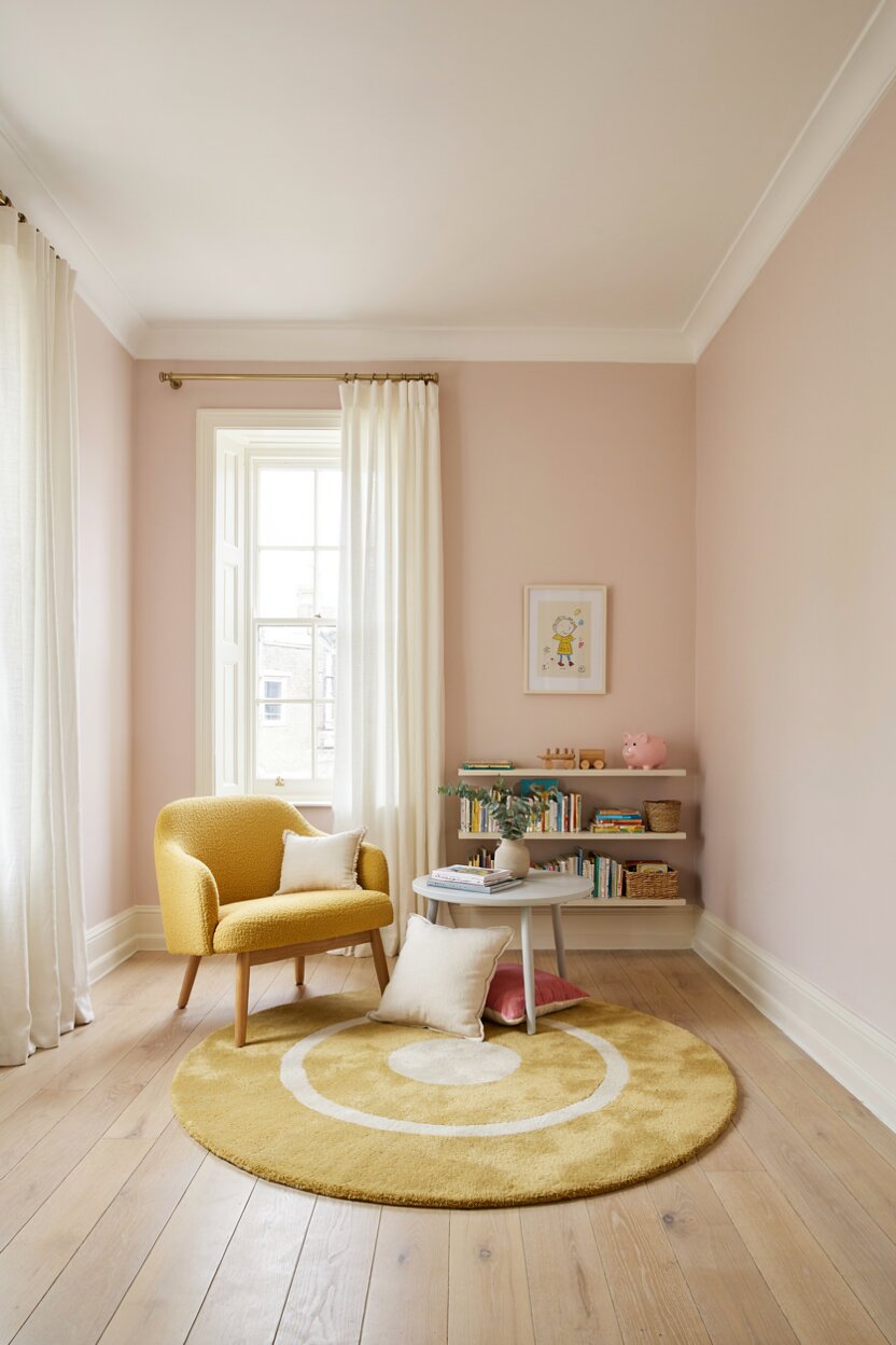
Sunny and cheerful. Soft pink with butter yellow feels like a breakfast nook on a good morning. Hot pink with mustard feels retro and lively. Either way, this color pairing wakes up a space fast. Try it in a playroom or a kitchen. Add white or cream so the two don’t compete. Yellow can be intense, so save it for chairs, a rug, or cushions rather than all four walls.
- 08 of 13
Pink + Orange
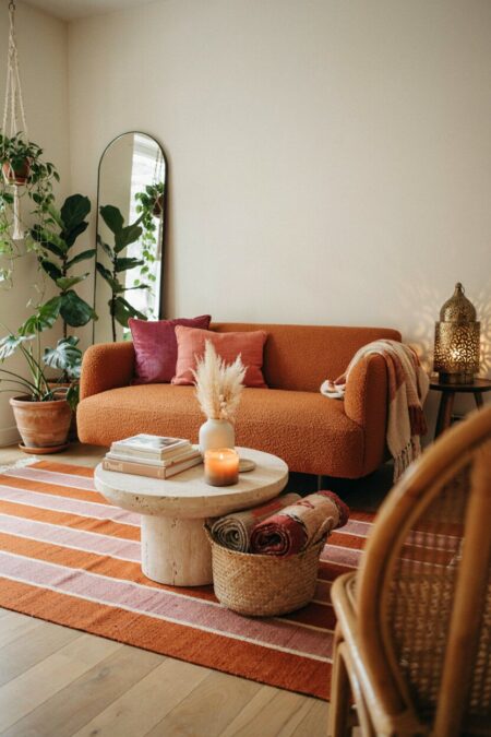
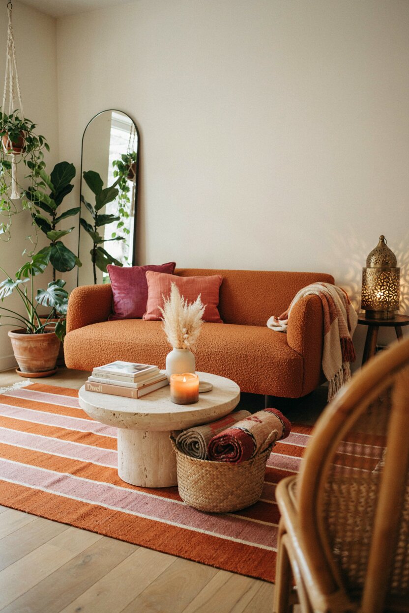
Daring? Yes. Delightful? Also yes. Pink and orange sit close together on the warm side of the color wheel, so the combo practically glows. Coral with terracotta is an easy place to start. For something bolder, set tangerine against magenta. A striped rug or floral throw can tie the two together. This duo suits boho and eclectic rooms especially well. Think sunset, all year long.
- 09 of 13
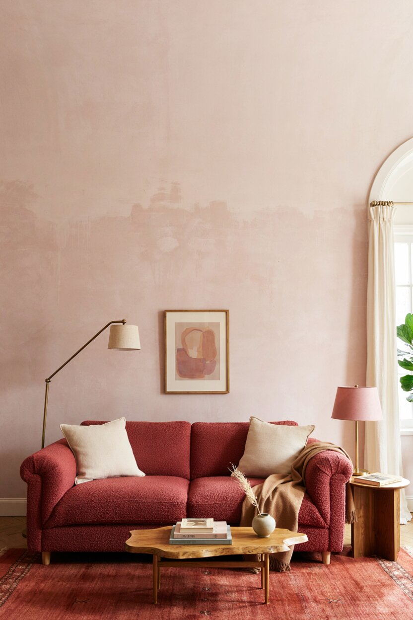
Pink + Red
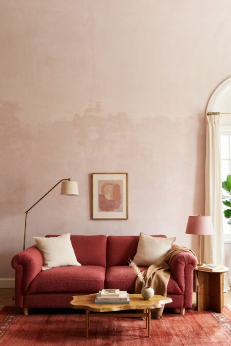
You may have heard that these two clash. Not so. Red and pink are close neighbors, and a tonal approach looks rich. Layer a raspberry sofa with a brick-red rug and a pale pink wall. Vary the depth of each shade so the room doesn’t turn into a single flat block. Choose one color as the star and let the rest support it. A little wood or brass will settle the heat.
- 10 of 13
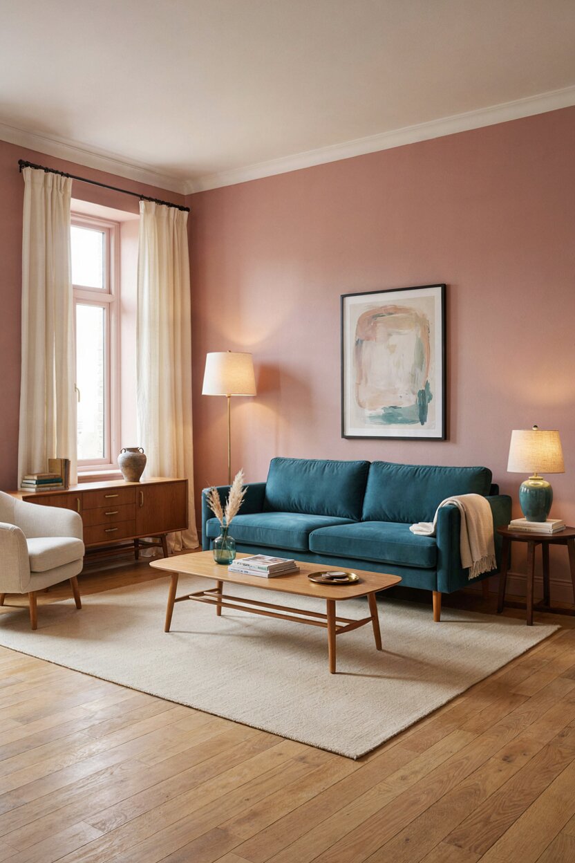
Pink + Teal + Cream
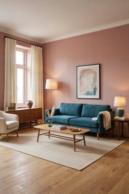
Teal is a color that pairs with pink in a surprising, peacock-feather way. Rosy walls with a deep teal sofa feel confident. Cream softens the jump between the two. Use it on curtains, lampshades, and bedding. The result feels collected and a bit vintage. A mid-century credenza in this trio looks especially sharp. Even a few teal accessories can lift a plain blush room.
- 11 of 13
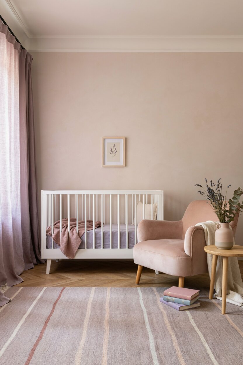
Pink + Lavender
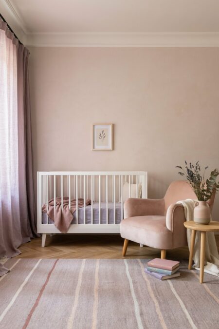
Soft on soft. Pink and lavender share a dreamy quality, which makes this color combination a natural for nurseries and quiet bedrooms. Layer different textures to keep it from feeling flat. Linen, velvet, and wool all work. For adult spaces, shift toward deeper plum and dusty mauve. A touch of silver or gray adds polish. Keep the lighting warm so the purples don’t turn chilly.
- 12 of 13
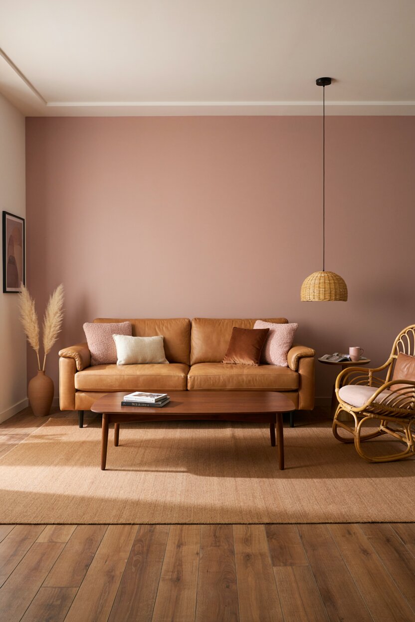
Pink + Brown + Tan
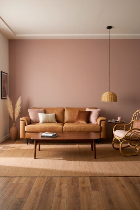
Chocolate and pink are dessert for the eyes. Warm brown grounds light shades of pink and gives them weight. Leather chairs, walnut tables, and rattan pieces deliver this look without any paint. Tan acts as the go-between, easing the contrast. It’s a cozy combo for living rooms. A muted rose wall behind a caramel leather sofa is hard to beat.
- 13 of 13
Pink + Burgundy + Olive
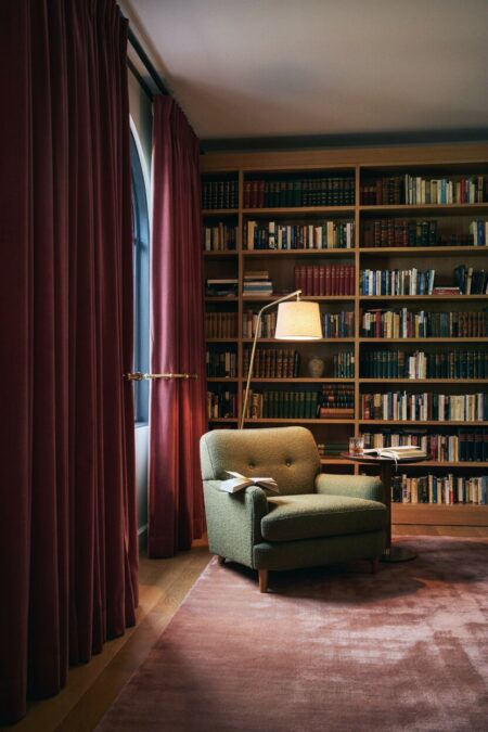
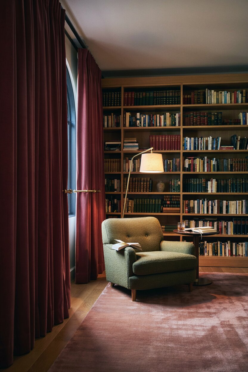
Moody and rich. Burgundy gives pink a deeper, wine-toned partner, and olive adds an earthy third note. The palette feels cozy in autumn but works in any month. Try burgundy velvet drapes, an olive accent chair, and a dusty pink rug or piece of art. It suits libraries, dens, and dining rooms where you want a little theater. Add warm lighting and the whole room settles in.