Cream is the quiet star of the color wheel. It sits between crisp white and sandy beige, and it brings a buttery glow to any room. Walls, sofas, curtains, kitchen cabinets: it looks good on all of them. Still, cream rarely works alone. The right color pairing is what makes it shine.
Shades of cream run from pale vanilla to rich custard, and each one leans a little warmer or a little yellower than the next. That matters. Hold your swatch up in daylight, then check it again under a lamp. Once you know your tone, use these ideas to find a color that pairs with cream beautifully. Some are soft. Some are bold. All of them earn their place.
- 01 of 12
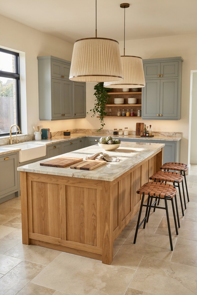
Cream + Sage Green
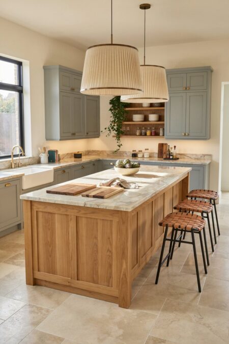
Sage is a gray-green with a dusty, calming feel. Next to cream, it looks like a garden at sunrise. This color combination suits kitchens especially well. Paint the cabinets sage and keep the walls cream. Then add a wood cutting board or two. The room will feel fresh without trying hard. Pick a creamier shade of cream here, because a stark one can make sage look flat.
- 02 of 12
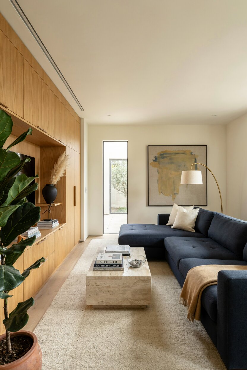
Cream + Navy Blue
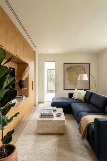
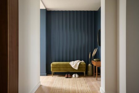
Navy gives cream a sharp, tailored edge. It’s a classic combo for a reason. The contrast is strong, yet neither color shouts. Try a navy sofa against cream walls. Or flip it and hang cream curtains beside a navy accent wall. A touch of yellow in your cream keeps the pairing warm and welcoming rather than cold. Brass lamps finish the look nicely.
- 03 of 12
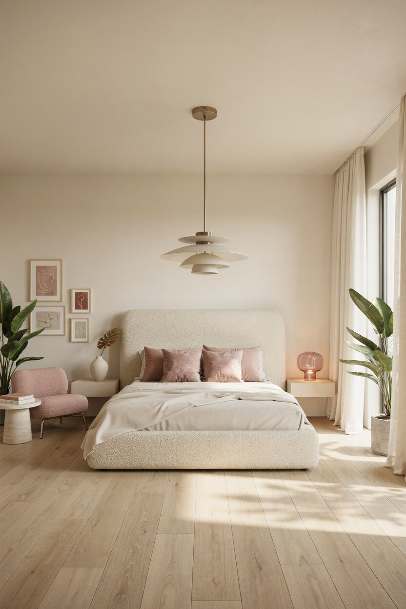
Cream + Blush Pink
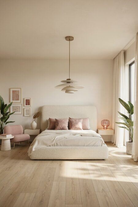
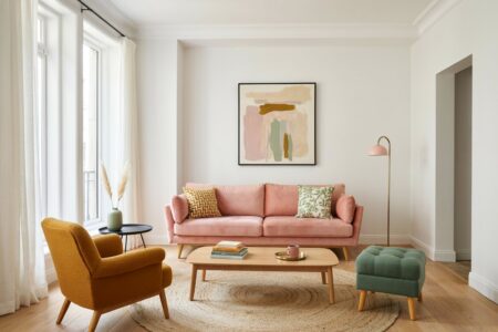
Blush and cream are close cousins. Both are soft, and both carry a hint of warmth. Together they feel gentle and a little romantic. This is a lovely color combination for bedrooms. Layer pink velvet pillows over a cream bouclé throw. Keep the pink dusty, not candy bright. A few pale wood pieces will ground the space and stop it from feeling too sweet.
- 04 of 12
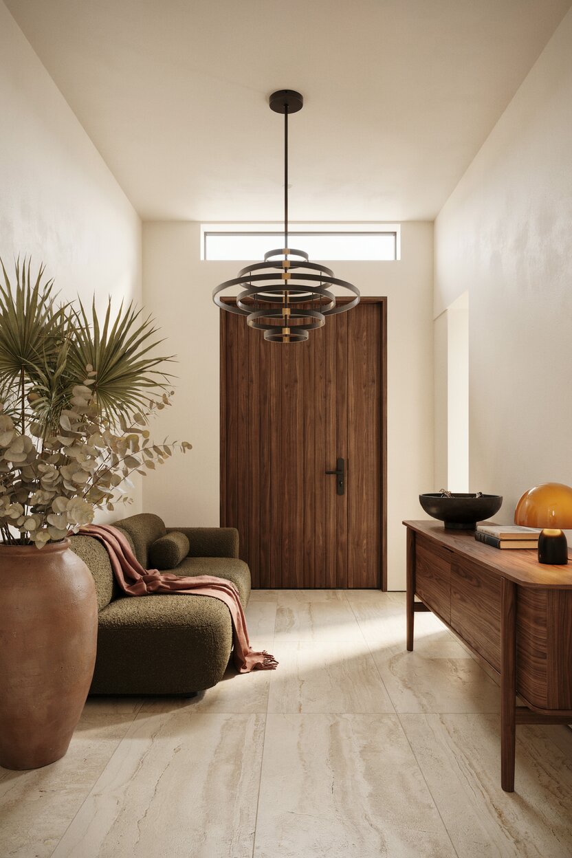
Cream + Terracotta + Olive
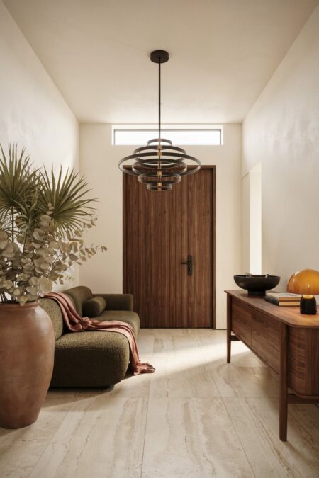
This trio brings the Mediterranean indoors. Terracotta is earthy and sun-baked. Olive is muted and leafy. Cream ties them together as a calm backdrop. Use cream on the walls, then bring in terracotta through pots, tiles, or a woven basket. Add olive in a rug or a few cushions. It’s a relaxed palette that looks better the more lived-in it gets.
- 05 of 12
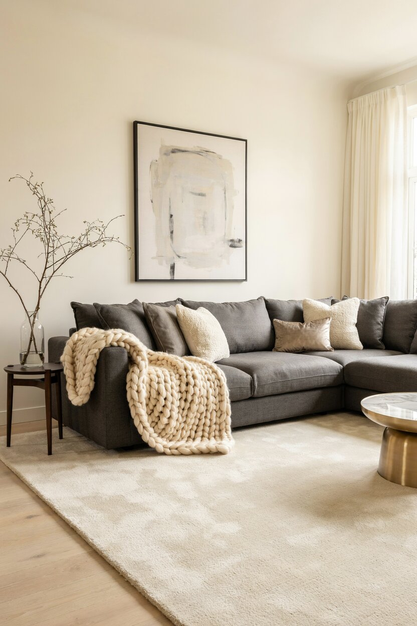
Cream + Charcoal Gray
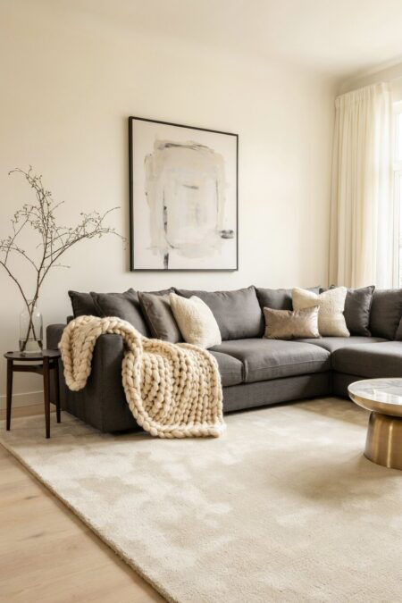
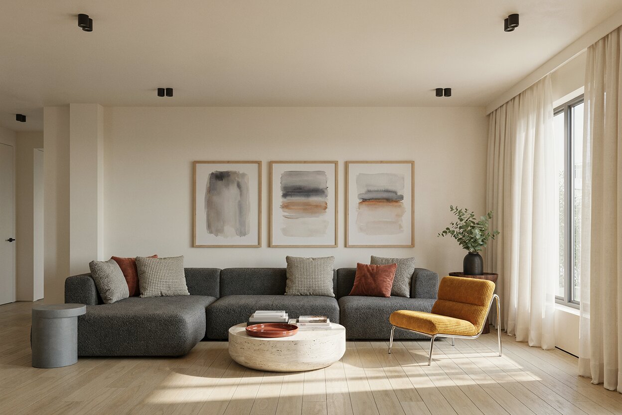
Charcoal is deep, moody, and modern. It anchors a room. Cream stops it from turning gloomy. Picture a charcoal sofa on a cream wall, with a chunky knit blanket draped over one arm. Simple. Gray can run cold on its own, so a warm cream is a smart color that pairs with it. The result feels polished but still cozy. This color combo works especially well in Japandi and Scandinavian style interiors.
- 06 of 12
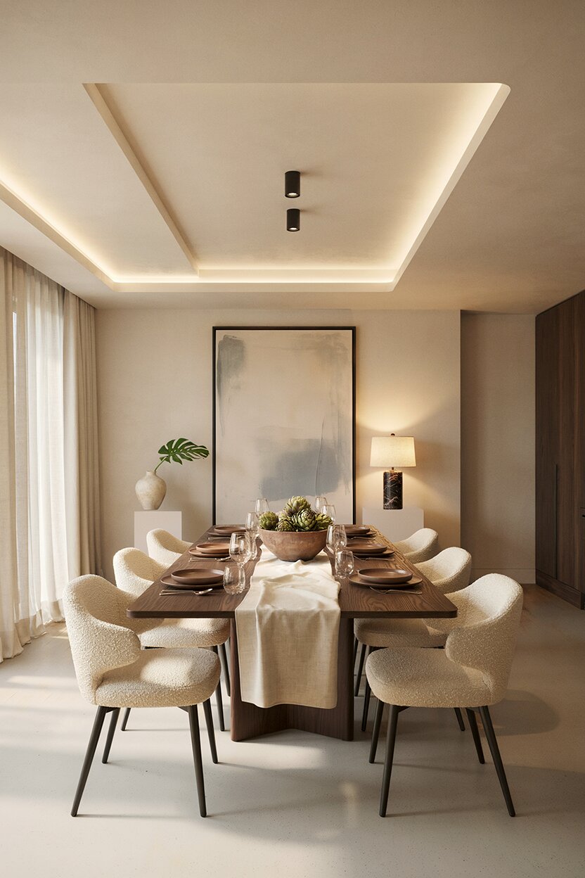
Cream + Chocolate Brown
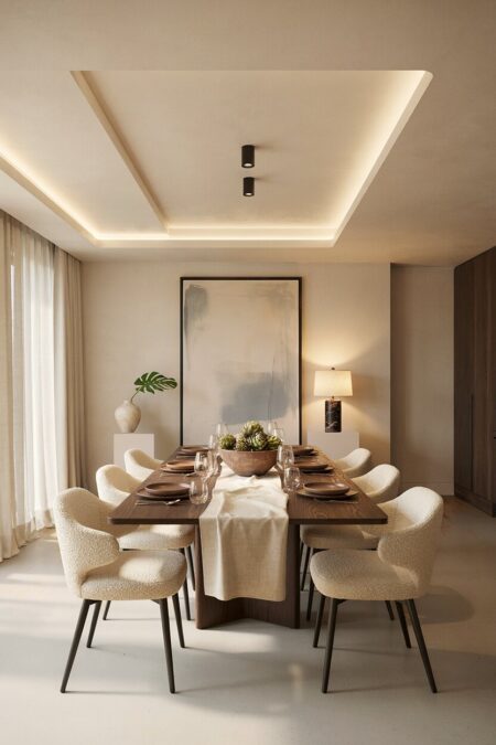
Think of a latte. Rich brown, creamy foam. That’s the mood of this combo. It works in living rooms, dens, and dining spaces. Leather armchairs, walnut tables, and cream upholstery all sit together comfortably. The look is warm and grounded. To keep it from feeling heavy, add a leafy plant or a pale linen curtain. Light helps.
- 07 of 12
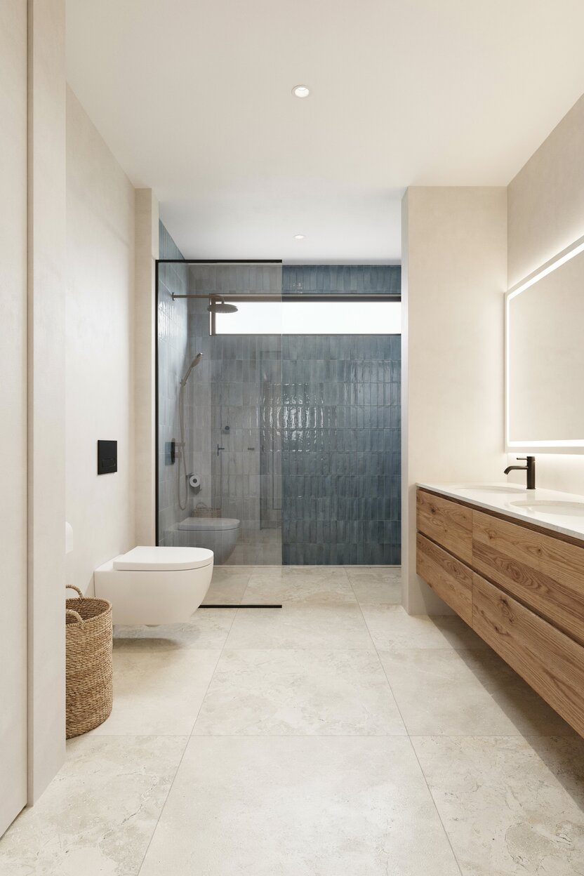
Cream + Dusty Blue
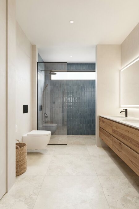
Dusty blue is softer than navy and more laid-back. It leans gray, which keeps it quiet. With cream, it creates a breezy cottage or coastal feel. Bathrooms love this color pairing. So do sunrooms. Try dusty blue tile with cream walls, or a faded blue rug under a cream slipcovered chair. Choose a lighter shade of cream so the blue reads clean and airy.
- 08 of 12
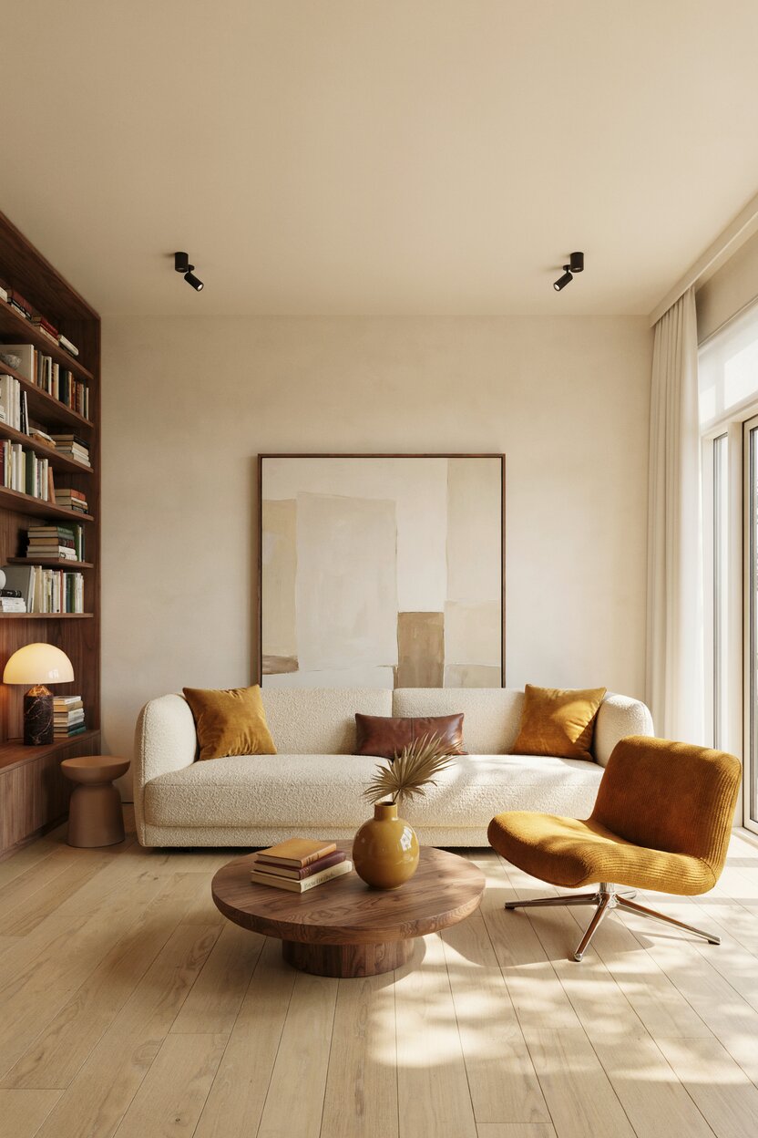
Cream + Mustard Yellow
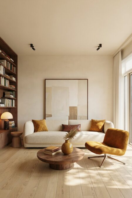
Mustard adds a spark. It’s golden, a little retro, and full of cheer. Cream keeps that energy in check. Use mustard in small doses: an accent chair, a pair of pillows, a vase on the shelf. A little goes a long way. Pair the duo with warm wood and a touch of brown for a 1970s-inspired look that still feels current.
- 09 of 12
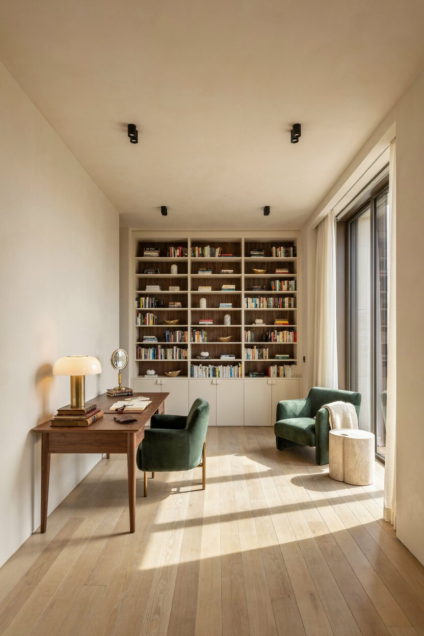
Cream + Forest Green
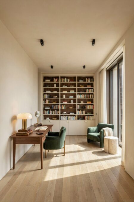
Forest green is deep and rich, like an old library. Cream lifts it. Together they feel classic and confident. Paint a study in forest green and trim it in cream. Or reverse the roles and let cream walls carry green velvet furniture. Brass hardware fits right in. It’s a combination that never feels dated.
- 10 of 12
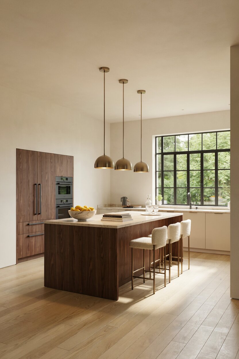
Cream + Black + Brass
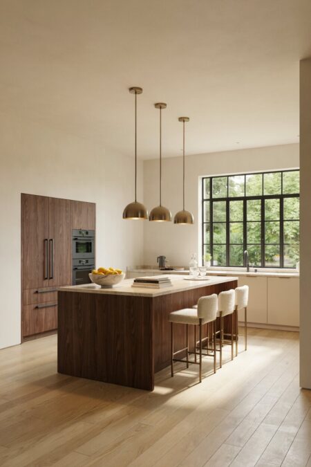
Here’s a dramatic combo with clean lines. Black frames the room. Cream softens it. Brass adds a gleam of warmth. Think black window frames, cream walls, and a brass pendant overhead. Use black sparingly so it acts like a sketch outline, not a heavy block. This trio suits modern farmhouse and contemporary homes alike.
- 11 of 12
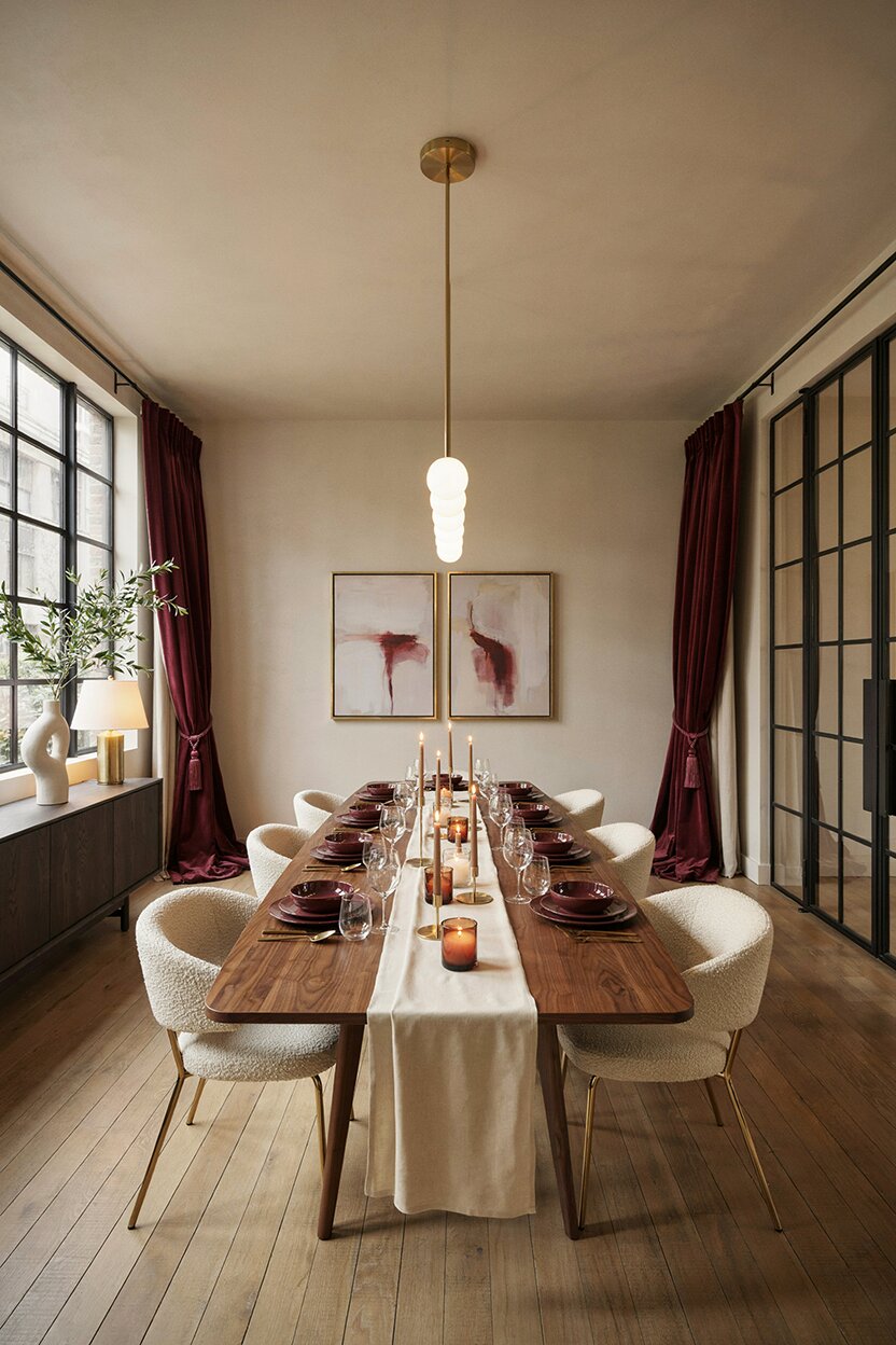
Cream + Burgundy + Gold
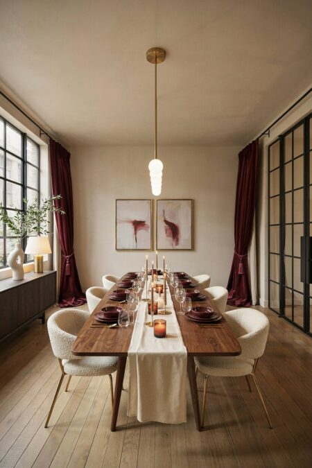
Burgundy brings depth and a hint of old-world luxury. Gold lights it up. Cream gives the eye a place to rest. This combination shines in dining rooms and formal sitting rooms. Try wine-red drapes, a cream wall, and gold-framed art. Keep the textures plush: velvet, silk, tassels. It’s a rich color pairing that feels made for candlelit evenings.
- 12 of 12
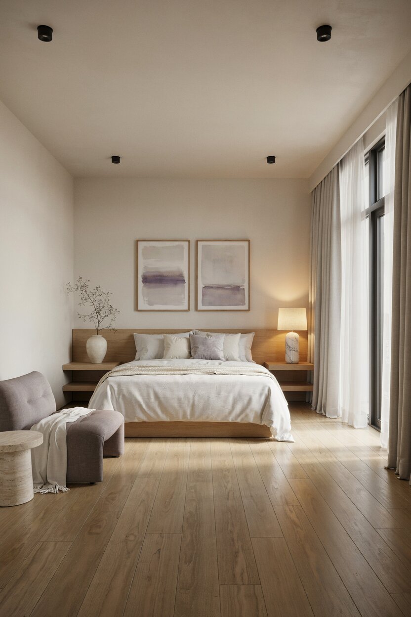
Cream + Lavender
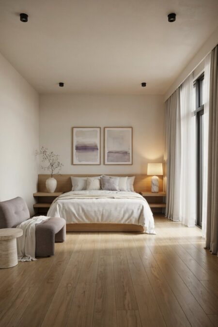
Lavender is an unexpected color that pairs well with cream. It’s pale, airy, and gently floral. Together they create a soothing space that suits bedrooms and nurseries. For a more grown-up take, choose a gray-toned lavender. Then add soft oak furniture and white linen bedding. The overall feel is calm. Almost dreamy.